Art History Analysis: Retrofuturism and Charles Schridde’s ‘House of the Future’
Schridde’s ‘House of the Future’
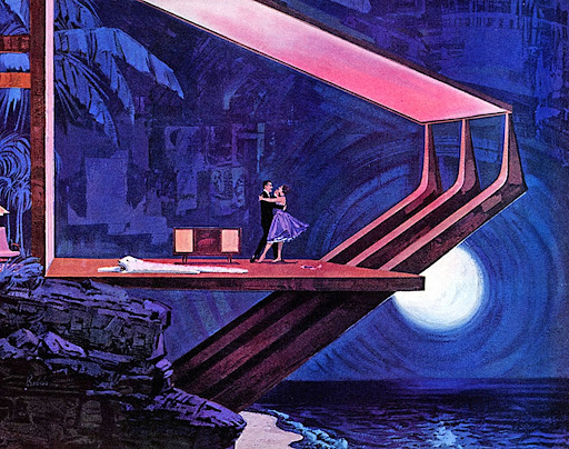
About 6 months ago, as I fell deep into the repetitive act of mindlessly scrolling through Pinterest on my phone, I stumbled upon some artwork that stopped my thumb in its tracks. Bold colors, a retro aesthetic, and a unique architectural style, this piece of artwork left me staring at it for minutes on end. The more I observed it, the more I absorbed the environment it portrayed. I felt completely immersed in the scene it depicted, despite having only been looking at it for a couple of minutes. This is none other than Charles Schridde’s House of the Future artwork.
Although I am a firm believer that an artist’s intention is not as important as how it resonates with the viewer, it did interest me to look into the historical context of why Charles Schridde felt compelled to create what he believed the middle-class house of the future would look like. To my surprise, the answer did not hold as deep of a meaning as I had hoped. This House of the Future art was nothing more than a series of advertisements that he was hired to illustrate for Motorola, an American electronics company. Suddenly, I did not feel quite as moved by what I thought had been a series of hopeful paintings that depicted a bright future with advancements in technology and architecture. Something about it felt less genuine, because the artwork was trying to sell me something. Then it hit me: What could be more telling of a time period than the advertisements that compelled people to support a company or product? And what values are reflected in this artwork that spoke to people of this era? After all, advertisement illustrations are artwork, too, and they are just as — if not more representative of — what we as a society valued during different time periods.
To begin, I knew I had to start my research by looking at the decade itself. The 1960s were a decade filled with optimism as technology advanced rapidly, along with social and political change. With the space craze making its way into American culture as NASA was sending rockets to space, people looked to the future with hopeful eyes, often theorizing about what the future of America would be like. The mentality of: “If we can put a man on the moon, then what else can we do?” found its way into the psyche of many Americans. I happen to find the “past’s predictions of what the future might’ve been like” concept quite interesting, because it acts as a time capsule. And after looking into it, the concept I find so compelling actually has a name: Retrofuturism. This term is defined as an artistic trend that portrays visions of the future. Or, to put it like Displate Magazine’s article, Retrofuturism: A Tomorrow That Never Was, “what people of yesterday imagined today would look like.”
Retrofuturism exploded onto the scene in the 1960s specifically as America grew in mass-production and innovation. To quote the same article: “In the 1960s, the possibilities of growth and development in many areas – artistic, social, scientific – seemed broader than ever. While in the midst of a cultural revolution, the Western world was also being transformed by significant technological advances, such as manned space travel, color television, and the advent of the internet. And it was against this backdrop of progressive social change and technological innovation that the near-utopian visions of tomorrow thrived.”
After reading a formal definition of retrofuturism, it makes perfect sense that this art form was used in advertisements. People are more likely to buy products that promise them a convenient and ideal life. Motorola did just that, promising customers that their optimistic futures could be obtained through the purchase of one of their products. And sure enough, Charles Schridde was the perfect artist for the job, having specialties in illustration and commercial design.
Now that we know that the artwork itself is an advertisement, it’s pretty difficult to look at his work and not spot Motorola products in the center of every single picture. But I wanted to look past that and return to the initial feeling the illustrations gave me. What specifically made me so invested in this one image specifically?

For starters, it was easy to determine the mood that the illustration portrayed. That is not to say that artwork with more of an ambiguous mood is not worthy of praise as well, but for an advertisement’s sake, being able to put yourself in the environment of the illustration relies on the mood. Charles Schridde himself even said: “I get caught up in the moment and paint what I feel about a place. The smells. The light. The excitement I feel. I realize I must put the paint on quickly or the moment will be lost, so I paint and think paint. I’m wound up like a dancer that must match the music. I must match the light, the color. I’m trying to catch the mood.”
In my opinion, his words definitely check out, with the scene feeling like it takes place in a well-thought-out universe. This piece specifically gave off a forgetful bliss to me, as if the couple were “dancing the night away.” With the woman’s shoes off, and her happy disposition, her mood feels careless in a good way, although it is more difficult to make out her face. The man, on the other hand, is more clearly smiling as he gazes into the woman’s eyes, and they dance with the moon as their backdrop. Something to note: the whole reason we can even see the moon is the futuristic architecture, with the house having completely glass walls. The linear style of the roof and the support beams actually suggests some mid-century modern architectural influence, which makes perfect sense, coming from an artist who was looking at the future through a 1960s lens. Something else to note: that 1960s value of optimism. This is clearly a future where people have it all: A large modern house on the water, the newest home technology, and with that, happiness.
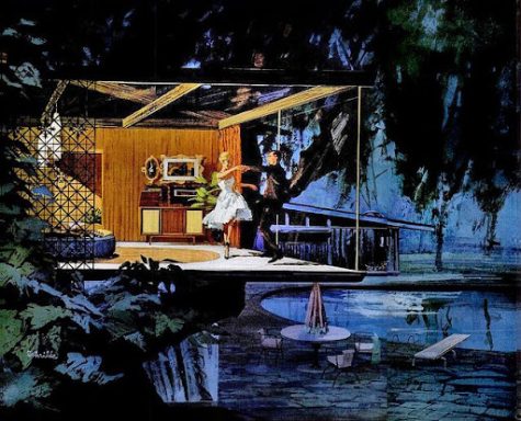
We can see this same optimistic tone in a similar illustration Schridde also did for Motorola in 1961. Similarly, this couple is “dancing the night away” as a Motorola record player is going in the background. The house is also adorned with glass walls, with a large swimming pool in the backyard. These people clearly live the ideal future lives. According to a Flashbak.com article titled House of the Future: Charles Schridde’s Stunning 1960s Adverts for Motorola: “Public response was so great that Motorola asked Schridde (even after he left the ad agency that Motorola had hired) to continue with a series of similar illustrations for its home electronics advertisements.” The promising future promised by these products was clearly enough to persuade people to buy them.
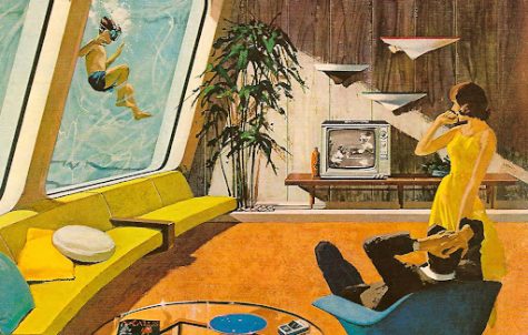
Another value of the 1960s Schridde’s artwork revealed was the emphasis on convenience. Obviously, with technology progressing rapidly in the mid-20th century, the goal was to make people’s lives easier. This trend can be seen in other areas as well during this era, food being one of them. For example, TV dinners (pre-made frozen dinners) along with pre-packaged cake mixes exploded into popularity during the 1950s and 1960s, both with the goal of making people’s lives more convenient. Unsurprisingly, these inventions coined the term “convenience foods” due to the revolutionary way in which they saved time in the kitchen. People naturally like things that are easy. So, creating advertisements that promised people a convenient way of life drove home the idea that by accepting new technologies into the home, you were taking a step towards an ideal and easy life. This can specifically be seen in a 1962 advertisement by Schridde. With a futuristic pool window that looks into your living room, you can get your laps in while also enjoying the baseball game. Similarly, the quality of your Motorola television is so good that you can watch even while you’re underwater. You no longer have to worry about straining your eyes while watching television, with screens as large as 19 inches. The very obviously relaxed position of the man on the chair says it all: he can sit back, relax, and revel in the future.
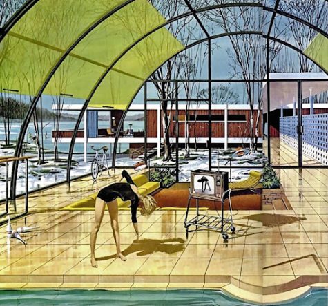
Similarly, in this 1961 advertisement, the convenience of having a portable television makes exercising easier. With an emphasis on the future of architecture, the woman in the illustration is doing her workouts within dome shaped windows in her home. She is not confined to her crowded living room, and instead has the space to exercise anywhere. This is an example of the value of convenience being directly linked to the value of freedom. When people’s lives are easier, they have the freedom to live the way they want to. Whether it’s our natural tendency to desire leisure or not, promising people a future of living conveniently and therefore, freely, would prove to work out well for Motorola.
The optimism of the 1960s led to the yearning for a futuristic utopia filled with technological advancements. Instead of technology being only an aspect of a hopeful future, it was driving a hopeful future, which I think Schridde’s artwork perfectly captures, advertisement or not. To quote episode one of the hit show Mad Men: “Advertising is based on one thing: happiness.” Whether quoting a TV show that came out almost 60 years later is relevant or not, that is clearly the case when we look at Charles Schridde’s illustrations. If Charles Schridde’s artwork for Motorola interests you, there are countless other examples, which you can find here. Retrofuturism, the tomorrow that could’ve been, certainly gives us a glance into the values of yesterday.
By Chloe Stefani ‘24, Fashion Editor
24cstefani@montroseschool.org